Having your website effects simultaneously a bunch of indicators, such as credibility, leads, organic traffic, marketing campaigns and more. Design is the first thing the user pays attention to when visiting your website. For this moment, there are over 26 millions of eCommerce websites worldwide. Do you know what this means? Increasingly more investments will be spent on attracting users’ attention.
So, to stay competitive and trendy, ensure your site has well-designed web pages and intuitive navigation. It may sound a little confusing, but keep reading to learn how this service will increase your income.
Key points
What is a custom website design?
Custom website design stands for the process of creating and modifying websites, taking into consideration the customer’s needs. This process means both design development from scratch and customization of ready-made templates from website builders, for example, in Shopify, Magento, or WooCommerce.
Designers create a unique shop that meets potential buyers’ needs and covers the biggest customer pain points. For the best result, a lot of work is done, since you need to analyze competitors, your target audience, and find out as much data about their references as possible. It’s also vital if you run a B2B or B2C business, since they have their specific moments. Once this data is used as a basis, the future website design concept is created.
Let’s also consider what pages are vital for web design. First and foremost, it’s a homepages, then pay attention to products, cart, checkout, purchase history and personal account pages. It’s crucial that the navigation is intuitive to provide the best user experience.
What are eCommerce web design benefits and why is it important?
Frank Chimero, an experienced designer, once said, “People ignore designs that ignore people”. It’s the best way to describe why this service is vital for online business. Nowadays there are a dozen of budget options to create a website using the constructor with a storefront. Individual design development has a number of advantages. Let’s dive into them.
Create a Strong Branding
Your webshop is your identity and the main way to show your difference and USP to more than 2.14 billion online shoppers. By using templates, you save money, but also may lose potential leads who are unlikely to pay attention to another typical site.
Get a Better SEO
To rank at the top of the search engine results, you have to ensure your SEO is high-quality. Custom design development allows you to optimize the content, infographics, page size and much more.
Improve User Experience
Based on the analysis of potential customers, you are able to get a portal that definitely meets their needs. Practically, it’s manifested in the right colors for banners, proper CTA forms, pop-ups for interactions, and others.
Scale Up the Business
Whatever the type of business you run, your main goal is to get more retail customers and increase the revenue. This means you need a website that can be easily changed with new features to meet demands as your company grows. For example, doubling the number of product or services categories.
Reach Mobile Users
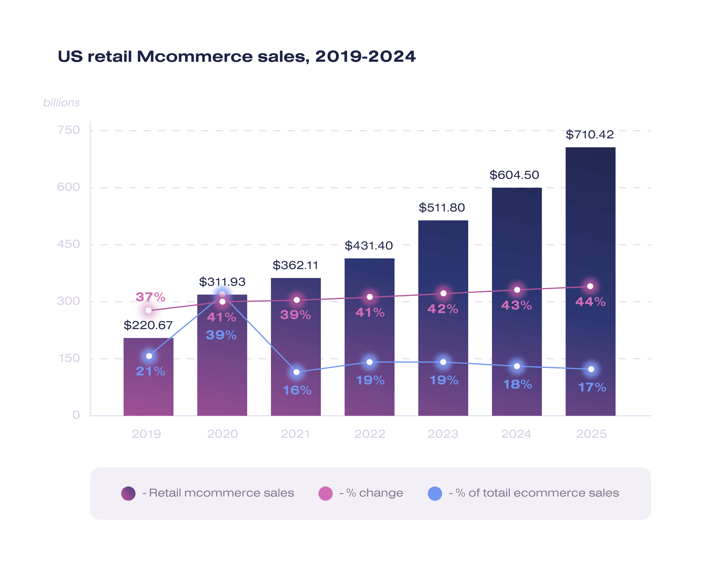
According to the Tidio report, the number of active mobile shoppers will exceed up to 187 million by 2024, and it’s only in the USA. No time to avoid offering mobile-friendly websites to users. With custom eCommerce website design you are able to catch more leads among mobile users and increase your sales.
Do you want to know more about how digital transformation can get you more customers? Check the case studies of 14+ years experienced Soloway agency.
Things and tips to consider when designing an eCommerce website
Designing a website is a complex process that requires combining several goals at once: presenting companies and selling the goods. Therefore, there are crucial and simple moments you have to consider to prevent unexpected mistakes or problems.
- The main advice is to keep it simple. The clearer design is, the easier it will be for customers to perceive information. Minimalism in design allows one to focus on vital things and find the needed page or element. Don’t pile up your storefront, otherwise users will get confused even on the home page.
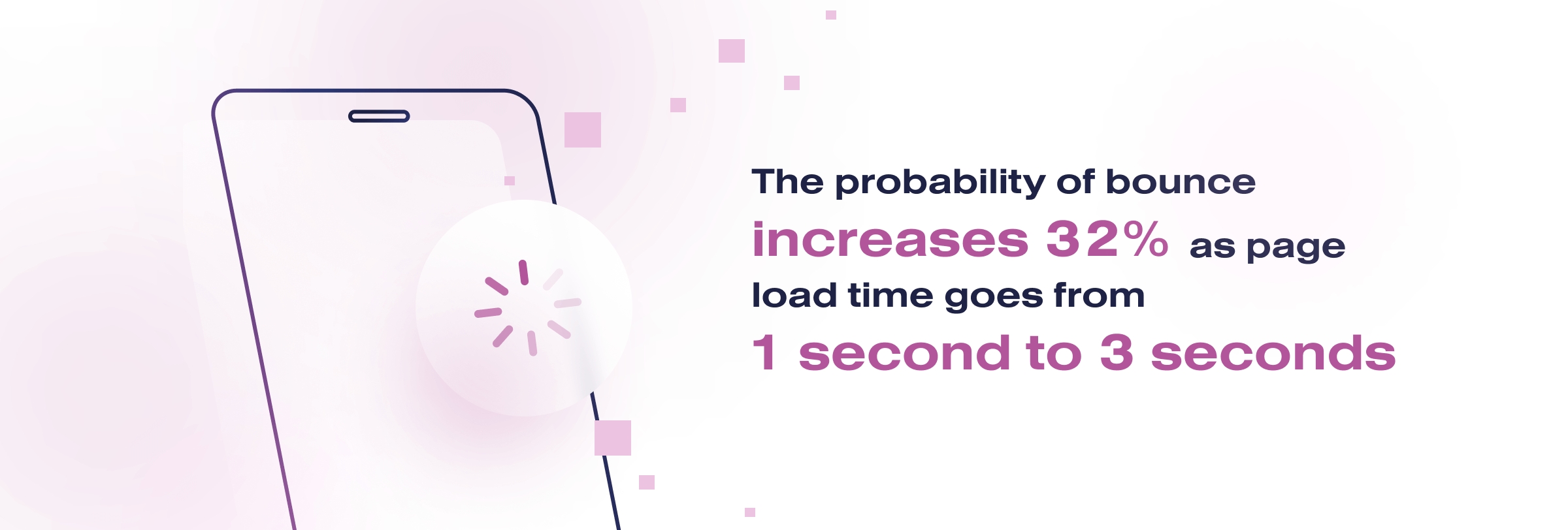
- Google report says that if the page downloads in more than 3 seconds, the probability of bounce increases 32%. Take the time to choose the proper images, create well-through-out content. Without it, your traffic will decrease and the site will become low rated.
- Add customer testimonials and detailed reviews, for example, in video or text format. It will help users learn more about the practical usage of products or services, and increase buyer’s loyalty. Of course, if you have thousands of items, it will be difficult, then it’s better to create a feedback form.
- Custom color palette, engaging graphic elements, the use of special characters that represent the company, all this brings you closer to customers. Think about what impression you want to reach, what would users think when they see your website?
- As soon as the visitor clicks on your website, each page should guide them to placing an order in your store. Keep in mind that the user will not necessarily get to the homepage. If a visitor doesn’t immediately understand where to click to get to the right page, you have lost a potential sale.
Top 5 best website design examples
In this paragraph we have selected samples of some of the best designs. They are outstanding and give inspiration for your own ideas.
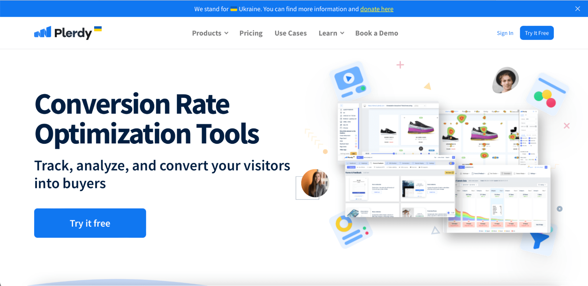
Plerdy
Plerdy offers solutions for conversion rate optimization, and the main point is that it’s clear from the very first glance at the site. The company’s USP and CTA are clearly visible on a simple white background. They don’t use much layouts, instead, the pictures on the right show the key metrics that Plerdy’s clients are able to use.
Thesus
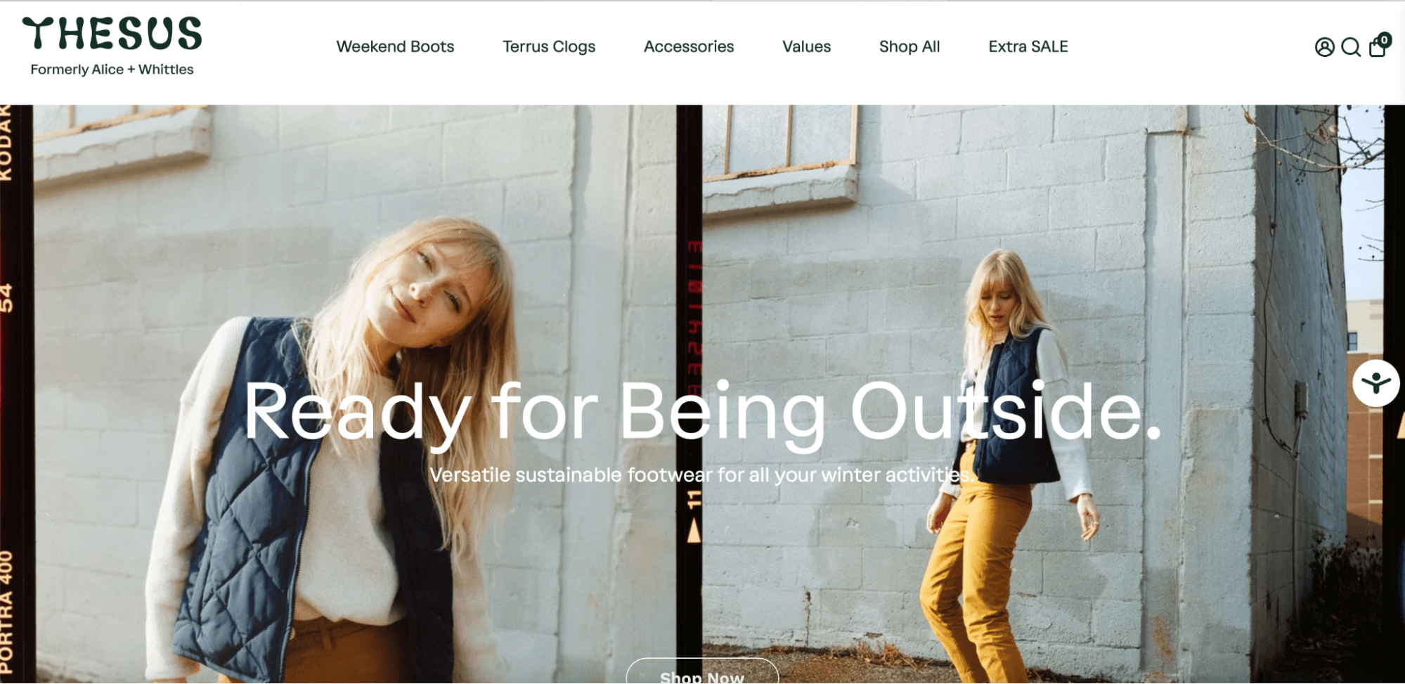
The first layout immediately shows the main purpose of the brand and the products it offers. Also on the homepage are the categories, and the visitor can click directly on the interested page, for example, with the largest discounts.
Subtle Asian Treats
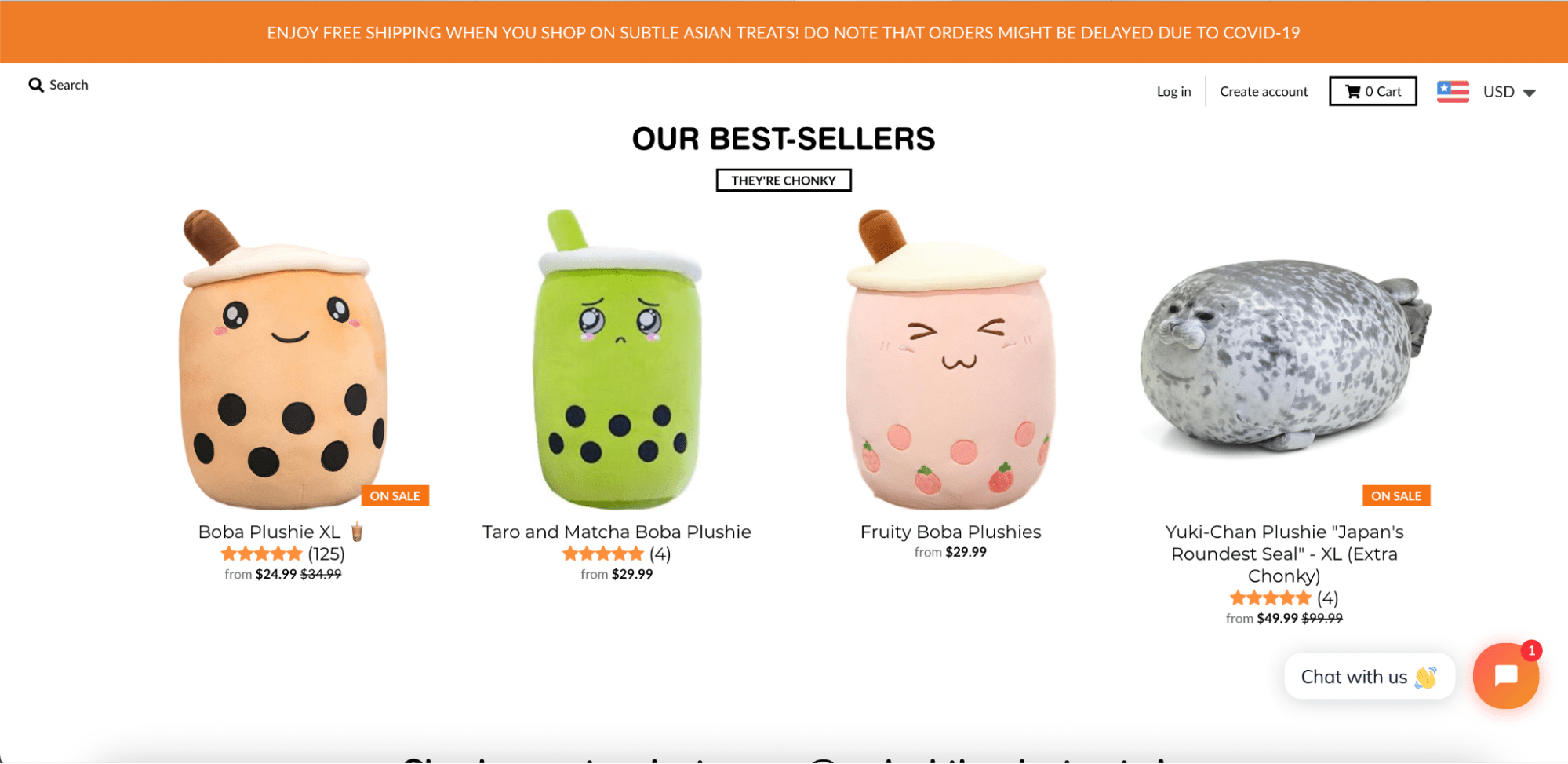
It’s a good example of how the product’s details can be structured. First of all, note that from the first page the visitor sees toys that are the most popular ones. The brief description contains the name of the product, and its rating based on reviews. Optionally, users are able to click on the image to get more details or to buy the toy.
Notion
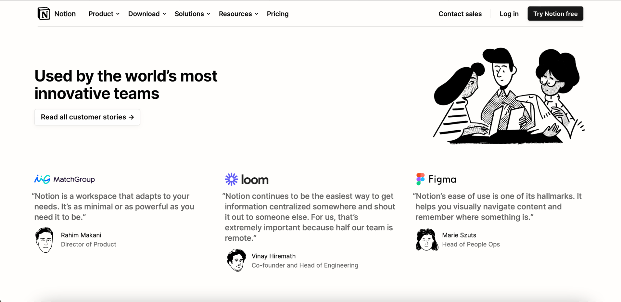
In the tips section, we talked about social proof. Customer’s feedback is the most popular one among other types. The company provides reviews from famous people, and it works for users who recognize them. The other point is about the unique characters’ design that distinguishes Notion among other sites.
Bite Toothpaste Bits
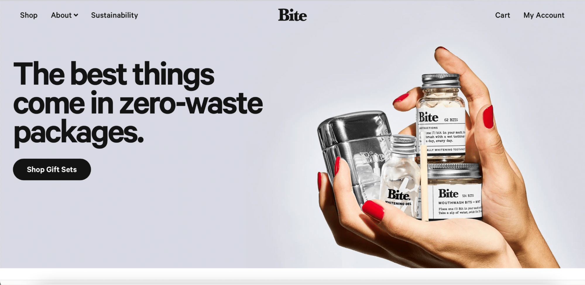
Their website attracts attention with high-quality photos, modern minimalistic designs, and a clear position — reducing the use of plastic. Among other features, they use detailed images of every position, carousel of several photos to demonstrate the use of each product.
Why should you outsource custom eCommerce website design and development?
When it comes to creating a website, the whole process is full of challenges. As Trish Parr said, “If you think Math is hard, try web design”. The most profitable and effective way is to hire a team of professionals, since you are able to receive:
- Full-fledged development
- Cost-efficient solutions in short terms
- Website updates with latest technology
- Maintenance service
- Risk-free partnership
Are you looking for a custom eCommerce website design service? Contact Soloway experts and start the project today.
To sum up
According to the Tildo report, 70% of Americans are shopping online in 2022. Being online is crucial for every eCommerce business that wants to grow and get more revenue. From the examples in this article, you have seen that the main award for investing in design is more potential leads, better ranking in search engines, and brand awareness.
Don’t hesitate to use our tips and grow in revenue. If you still have questions to a tech company, drop us a comment right below ?


